Skydo
Skydo claimed its edge. A sharper identity for clarity in cross-border payments.
2026
Self-initiated Rebrand

Hi — this is a self-initiated exploration of Skydo. I’ve known Skydo for a while. While I personally use Wise for international payments, Skydo always stood out to me because it’s built specifically for Indian businesses receiving money from abroad. One day I started wondering:
What would happen if Skydo was positioned more boldly? So I began digging. I researched the product, the competitors, and the real frustrations Indian service exporters face when receiving international payments. Hidden FX spreads. Unclear fees. Documentation headaches. And then something clicked.
Skydo had a differentiator most fintech brands overlook: clarity of outcome. You know what lands before it leaves. That insight opened the door to a sharper positioning and a more confident brand direction.
This case study explores how Skydo could evolve from just another fintech tool into a brand that represents predictable global earnings for Indian businesses.
Below is the process that led to that idea.
Overview
The project
A strategic rebrand exploring how Skydo could sharpen its position in cross-border payments for Indian businesses. Reframing the platform around predictability, clarity, and financial confidence.
A system designed to communicate control over global earnings.

Discover
The reality
Cross-border payments were built for banks, not for the businesses now earning globally. India's service exports $300B annually, yet much of that money still travels through system filled with hidden FX spreads, unclear deductions, and slow compliance. Businesses can't quote confidently when earnings are unpredictable.
Skydo was built to remove uncertainty around it.
India's global earnings.

Define
The claim
Most payment platforms compete on speed, reach, or convenience. Skydo's advantage is different.
It removes the uncertainty around global earnings. A system where the amount a business invoices is the amount it keeps.
The Idea
Keep what you earned.
Tone of voice
Straightforward
Skydo speaks plainly. No jargon, no inflated claims. Fees, rates, and outcomes are stated exactly as they are.
Messaging
Precise
Every words reflects clearly. Numbers are shown clearly, and explanations are simple.
Uncompromising
Skydo speaks with clarity and conviction, challenging the old system with transparency.
Skydo's messaging follows the umbrella method - a simple structure where one central idea is reinforced by a small set of supporting messages.
Keep what you earn.


Design
The logo
Where everyone was in a rat race for logo marks, Skydo had the chance to claim the place, and the logotype is the reflection of it. The combination of Host Grotesk and Quera Demo does represent modern India.
Inspired by the modern India, and its culture, Quera Demo, stands out instantly and easily recognizable.
The typeface


Inspired by the variety of India, quiet at the core, vibrant at the edges. A palette built to signal clarity, momentum, and modern finance.
The colors
Core colors
Inspired by the vast Indian sky, the twin blues form a foundation of openness, clarity, and limitless earning.
Complementing the sky-inspired blues, a set of vibrant color pairs draw from the richness and cultural variety of India—bringing warmth, energy, and human character to the system.
Secondary colors


Deploy
The verbal identity
How do you deploy the verbal identity in integration with visual identity, that works across all over the country consistently?


Deliver
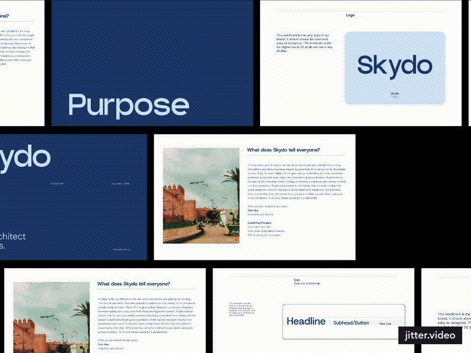
The guidelines
The final stage focused on equipping Skydo with everything needed to apply the brand consistently across teams and touchpoints.
A concise brand guideline system was developed to document logo usage, typography, color relationships, grid principles, and verbal identity. These guidelines ensure the brand remains clear, coherent, and recognizable wherever it appears.
Alongside the guidelines, a flexible library of brand assets and templates enables the Skydo team to implement the identity across product, marketing, and communication with confidence.
With the system defined and the tools in place, the brand is ready to scale.
Skydo's photography always embraces the cultures of India. It demonstrates the unity, the energy and the modern growing lifestyle of Indians.
The photography


